Colour and Calm: How Palette Choices Affect User Stress Levels

The Impact of Colour on Emotions
Colour plays a significant role in our daily lives and significantly affects our emotions and behaviours. When it comes to design, the choice of colour palette can influence user stress levels and overall well-being. Understanding the psychological effects of colour can help in creating environments—both physical and digital—that promote calmness and reduce stress.
The Psychology of Colour
Different colours evoke different emotional responses. For instance, blue is often associated with tranquility and reliability, while red can evoke feelings of urgency and excitement. It is essential to consider these associations when designing spaces or interfaces where user experience is a priority. A well-thought-out colour palette can either soothe or provoke, depending on the context and usage.
Calm-Inducing Colours
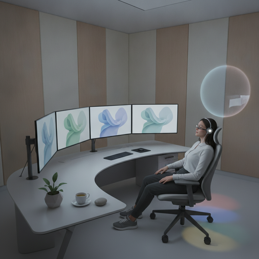
Research shows that cool colours, such as blues, greens, and soft pastels, can create a sense of peace and relaxation. These colours are often used in environments like hospitals and wellness centres, where reducing stress is paramount. By incorporating these calming hues into design, creators can foster an atmosphere that promotes comfort and serenity.
Contrast and Balance
While calm colours are essential, the balance and contrast in a colour palette also play a crucial role. Too many vivid colours can create visual chaos, leading to feelings of anxiety. A harmonious combination of calming colours, paired with strategic pops of brighter hues, can enhance mood without overwhelming the user. This balance is important in both physical spaces and digital interfaces.
“Design is not just what it looks like and feels like. Design is how it works.” - Steve Jobs
Practical Applications
Incorporating calming colours into design can be particularly beneficial in areas where users may experience stress, such as healthcare, education, and workplaces. For example, a website designed for mental health support could utilise soft greens and blues to create an inviting and reassuring atmosphere, allowing users to feel at ease as they navigate the site.
Conclusion
The power of colour is undeniable. By understanding how different hues can affect stress levels and emotional responses, designers can create more thoughtful environments that prioritise user well-being. A carefully curated colour palette not only enhances aesthetics but also has the potential to significantly improve user experience by fostering calm and reducing stress.